Darkhorse Analytics and Economic Policy Institute Unveil Redesigned Data Library

In collaboration with the Economic Policy Institute, Darkhorse Analytics is proud to announce an all new redesign of the State of Working America Data Library.

The State of Working America Data Library is a vital resource, providing researchers, media, and the public with easily accessible, up-to-date, and comprehensive historical data on the American labor force.

Compiled from Economic Policy Institute analysis of government data sources, it enables users to explore critical topics like wages, inequality, and other economic indicators over time and across demographic groups.

Fundamentally, this library wasn't just designed to store data--it was built to empower people to tell truthful stories about the economic conditions faced by everyday working Americans.

With the new redesign, insights are not only easier to access, but are more engaging, impactful, and actionable than ever before.

Here are five ways this site now lives up to its mission, exceeding what came before and inspiring what comes next:

1. Dynamic Featured Indicators: Data That Speaks Volumes

The new homepage brings storytelling with data to the forefront. Key economic indicators are featured front and center, highlighting urgent issues like income inequality, employment disparities, and poverty rates.

Users are empowered to see trends and inequalities at a glance, sparking meaningful conversations and driving action on behalf of the working class and underserved communities.

2. Empowering Long-Term Sustainability: A Self-Service Platform

The foundation of any impactful tool is flexibility. For the Economic Policy Institute, we built a seamless, self-service data management pipeline to keep their platform adaptable and up-to-date—no outside help required.

Why was this so important?

  • Multiple data sources: Indicators arrive at different frequencies—monthly, quarterly, annually—so flexibility is critical to stay current.

  • Wide range of indicators: Covering many economic equality measures demands a tool that can grow and evolve with new topics.

  • Real-time relevance: Keeping the platform updated ensures the public stays informed about the latest trends in economic equality.

  • Mission-driven adaptability: The tool supports their evolving goals, rather than locking them into a static solution.

Want to add a new topic? Done. Need to refresh indicators or update descriptions? Easy. The result? A site that serves their mission—and their audience.

3. Transformative Visualizations: From Static to Storytelling

The new data library transforms overwhelming tables of information into an intuitive and engaging exploration experience, empowering users to uncover meaningful insights with ease.

An image of the old data library.

Visuals are powerful storytellers. The new site moves beyond static tables to bring data to life with dynamic line charts and cartograms.

Whether users need to examine trends over time or compare states at a single point, they can now see the story data is telling in vivid detail.


4. Twice the Data, Half the Effort, Infinite Insights

One challenge we overcame in this project was consolidating data previously housed in multiple different websites into a single, user-friendly site. This included adding state-level data for the first time, enabling improved visibility into disparate economic outcomes across states.

The all-new state cartogram view unlocks previously inaccessible state-level insights, offering a clear, point-in-time comparison across regions.

Despite doubling the available data, the new design makes finding and exploring insights more intuitive than ever. What was once overwhelming is now accessible, unified, and actionable.


5. Custom Comparisons: Letting Users Write Their Own Stories

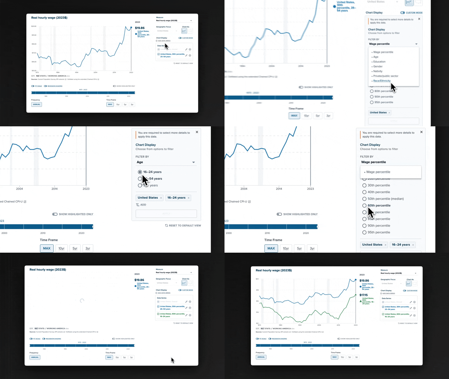
This scenario compares 16-24 year olds to 25-45 year olds within the 60th wage percentile nationwide, showcasing the tool’s ability to analyze custom, niche comparisons.

One of the most exciting features of the new site is its “custom mode.” Users are empowered to compare specific data sets—for example, Black women versus White men nationally—and build their own visual charts and stories.

This unprecedented flexibility ensures that anyone engaging with the platform can uncover the insights most relevant to their research.


By combining the desire for storytelling with intuitive and responsive design, the redesigned platform empowers the Economic Policy Institute to amplify their voice.

Darkhorse Analytics extends gratitude to the Economic Policy Institute for their partnership and trust in bringing their vision to life.

Darkhorse Analytics Introduces The Interactive Data Viz Academy

Darkhorse Analytics is proud to introduce The Interactive Data Viz Academy, a free two-day intensive workshop designed for principal investigators, NGO leaders, and researchers seeking to elevate their data visualization projects.

This program focuses on providing the framework to create impactful visualizations that resonate with policymakers, funders, and the public. By combining proven frameworks with interactive sessions, participants will leave with a clear, actionable roadmap for their projects.

The workshop features a blend of educational and collaborative sessions - participants will gain insight into what it takes to create visualizations that amplify their research and advocacy.

This includes:

  • A Strategic Framework - Developing a clear direction for visualization goals that align with purpose, audience, and data.

  • Clarity of Constraints - Learning the principles of effective visualizations and identify what’s possible and practical for participants’ goals.

  • Essential Tools and Techniques - Exploring the workflows and methods that will bring participants’ visual communication tool to life - from concept to execution.

  • Funding and Success Strategies - Discovering practical approaches to navigating funding and the administrative challenges of complex visualization projects.

Sessions are led by Daniel Haight, president of Darkhorse Analytics, drawing on years of experience delivering impactful visualizations for clients across sectors.

Participant Criteria

The workshop is designed for decision-makers with a clear vision for a data visualization project. Ideal candidates include principal investigators, NGO leaders, and foundation program managers with data and resources ready to activate.

Participation is limited to maintain a collaborative and focused environment. Applications will be assessed based on project readiness and alignment with the workshop’s goals.

Key Details

  • Dates: January 14 & 15

  • Format: Two half-day Zoom sessions with a mix of presentations and interactive discussions.

  • Cost: Free for accepted applicants

Application Process

Interested individuals are invited to apply through a short submission outlining their project’s scope, goals, and current status. Shortlisted candidates may be contacted for additional information before final selections are made.

Advancing the Mission

The Interactive Data Viz Academy embodies Darkhorse Analytics’ ongoing mission to make brilliance accessible. This program represents a bold step forward in empowering leaders with the expertise to create data visualizations that inform, inspire, and drive impact.

More information and applications are available at the following link: https://hubs.la/Q02ZX7N10

Darkhorse Analytics Wins Two Anthem Awards for Data Visualization Excellence

Darkhorse Analytics is proud to announce that two of our projects—CORE Score Data Visualization and AIDSVu Interactive Map & Location Profiles—have been honored with Anthem Awards. These recognitions highlight our commitment to using data to create meaningful change.

The Anthem Awards celebrate purpose and mission-driven work, and we are proud to see these projects recognized. Here’s a closer look at each:

CORE Score Data Visualization - Silver Anthem Winner in the Diversity, Equity & Inclusion – Best Use of Data category

Developed in partnership with The American Academy of Arts & Sciences, CORE Score helps decision-makers identify gaps and opportunities to advance equity. This tool is a powerful example of how clear, actionable insights can guide smarter policies for a fairer future.

AIDSVu Interactive Map & Location Profiles - Silver Anthem Winner in the Health – Best Use of Data category

Built in collaboration with Rollins School of Public Health at Emory University and Gilead Sciences, AIDSVu combines public health data and intuitive visual storytelling to drive informed decisions in the fight against HIV. The interactive map and profiles empower communities, advocates, and policymakers with data they can act on.

These projects support our mission “Make Brilliance Accessible” by making impactful data accessible to change-makers, policymakers, and the public. CORE Score and AIDSVu were designed to transform complex datasets into tools that drive meaningful action and inspire positive change.

A huge thank you to our partners who trusted us with their vision. These awards are shared victories and a testament to the power of collaboration.

Darkhorse Analytics also thanks the Anthem Awards for shining a spotlight on data as a driver of change.

Darkhorse Analytics Unveils Advanced AIDSVu and HepVu Interactive Maps

Darkhorse Analytics is proud to announce the launch of its newest visualizations, the AIDSVu and HepVu Interactive Maps. 

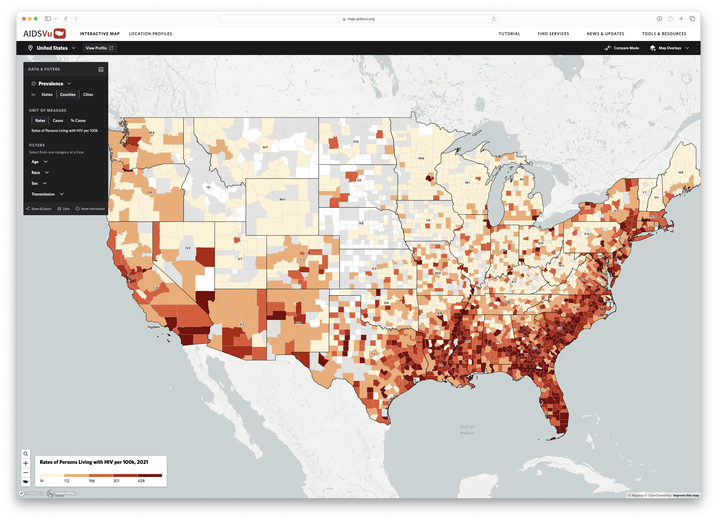
Developed in partnership with the Rollins School of Public Health at Emory University and Gilead Sciences, AIDSVu and HepVu use feature-rich interactive maps and polished location profile reports to offer an in-depth understanding of the impact of HIV and viral hepatitis across the United State

AIDSVu: Empowering Public Health with Data-Driven Insights 

AIDSVu.org is an innovative online mapping tool designed to reveal the impact of the HIV epidemic on communities throughout the United States. By increasing disease awareness and promoting data-driven public health decisions, AIDSVu aims to empower policymakers, researchers, and interventionists to address critical challenges and make significant impacts. 


Through data storytelling, Darkhorse Analytics has simplified complex data, making it accessible and actionable. The AIDSVu Interactive Maps help users to: 

  1. Identify Underserved Areas: Pinpoint where resources are needed most. 

  2. Uncover Targeted Insights: Understand how HIV affects specific communities based on race, sex, and other factors. 

  3. Track Policy Impact: Monitor trends to measure the effectiveness of policies. 

These tools empower public health decision-makers to understand underserved areas and evaluate the effectiveness of their policies. Additionally, local advocates can use the data to support applications and petitions for increased HIV funding. 


HepVu: Visualizing the Impact of Viral Hepatitis 

Alongside AIDSVu, Darkhorse Analytics has also launched the HepVu interactive mapping tool focused on visualizing the impact of viral hepatitis in the United States. HepVu provides similar tools and insights to support public health initiatives, using data from reliable sources to help users understand the prevalence and impact of viral hepatitis across various demographics and social factors. 

For more information about the AIDSVu Interactive Map and Location Profiles, visit https://map.aidsvu.org and for HepVu, visit https://map.hepvu.org


About Darkhorse Analytics: 

At Darkhorse Analytics, we specialize in turning complex data into clear, actionable insights through cutting-edge visualization solutions.  


Our innovative approach empowers organizations to make informed decisions with confidence. With a relentless commitment to impact, we transform complex data into bespoke visualizations that drive meaningful outcomes. 


Contact:  

info@darkhorseanalytics.com