/* This was previously here but our codes are different. Don't know what UA-88681353-1 is.
(function(i,s,o,g,r,a,m){i['GoogleAnalyticsObject']=r;i[r]=i[r]||function(){
(i[r].q=i[r].q||[]).push(arguments)},i[r].l=1*new Date();a=s.createElement(o),
m=s.getElementsByTagName(o)[0];a.async=1;a.src=g;m.parentNode.insertBefore(a,m)
})(window,document,'script','https://www.google-analytics.com/analytics.js','ga');
ga('create', 'UA-88681353-1', 'auto');
ga('send', 'pageview');
*/
Using physical objects to display data and create visualizations may seem counterintuitive, but doing so can be incredibly effective and engaging. We’ve put together a list of the Top 5 physical visualizations we’ve come across.
Have you ever wondered if there was a better way to visualize your data? To make it more engaging, more visually impressive, or clearer to your audience? We’ve put together a list of the Top 5 maps we’ve come across.
A few years ago we worked with the Alberta Government on a tool that would make Fish Consumption Advisories more accessible to the general public. And after working its way through the government’s approvals process that tool is finally here.
If you’ve tried to visualize your data with a map, you know how time-consuming it can be. It shouldn’t take so long or be so difficult, so we built MapInSeconds.com, which takes your data and generates a map - in seconds.
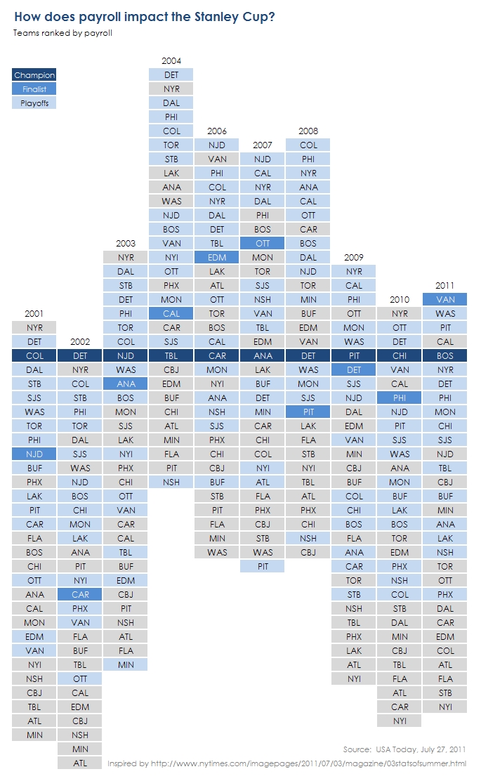
Interactivity can provide whole new perspectives, facilitate more comparisons, and encourage exploration and discovery. See what stories are revealed in our new interactive NHL visualization.
People highly value style, even to their own detriment. That means we need to value style but execute without causing detriment. We need to find a way to ensure that we not only deliver data in a meaningful way but also seek to deliver it in a compelling/engaging style.
Over the past few months I've become increasingly fond of Edward Tufte's Slopegraphs for data visualization. They aren't just good for comparing across time, but also across two categories.


We combined storytelling, 3D mapping, and data about the hundreds of neighbourhoods in Edmonton to create “This is Edmonton”.