This is part one of a two-part series on building effective visualizations. In this post, we take a shallow dive into evaluating existing visualizations. In the next post, we’ll dive a little deeper as we explore techniques on how to improve them.
It’s very easy to visualize data. Too easy.
The problem is that it’s rarely done well. It’s very easy to chart your data in current software tools. But it’s very hard to get people to understand that chart. As a result, we’ve become accustomed to complex, confusing, and essentially useless visualizations that obfuscate rather than inform. The visualization gets in the way of the truth. Google returns almost limitless examples when you search for “poor data visualization examples”. And those are the public ones that someone has gone through the trouble of critiquing.
Try it out for yourself. If your company has dashboards, check out the usage stats. I bet the majority of them haven’t even been viewed in the last six months, let alone used for decision making.
Either consumers of visualization are jaded and lazy or it’s our fault for creating ineffective examples.
Let’s buck the trend. There’s still lots of space for improvement. We’ll start by reverse engineering an effective visualization to see if we can glean some insights that will improve our craft.
The visualization below shows the number of suicides by single year of age, England and Wales, deaths registered between 1981 and 2017
The annotations provide some high level insights: different eras have suicide hot spots in different age cohorts. You can hover over the lines to see single years.
But a closer look shows something fascinating: the propensity for suicide follows a cohort. Generation X (people born in the sixties and seventies) began committing suicide in their late teens and continue at a higher rate to this day. Similarly, people born during WWI and the early 1920s have an elevated rate well into their eighties.
This drives me to speculate what is causing this. Did living your teen years in the Great Depression predispose you for suicide? Or perhaps living through or fighting in WWII is the cause? And what is so different about Generation X coming of age in the eighties?
The visual is fascinating. You find yourself looking for other patterns and speculating on causes and effects.
Why is the visual so effective? There are lots of elements we could evaluate, but let’s start by looking at two dimensions: clarity and engagement.
Clarity
Clarity can be measured by how quickly you “get it” (normalized by information density). Or maybe how long it takes for you to make a decision based on it.
When someone shows you a clear visualization, you don’t need an explanation. You look at it for a few moments and you start to draw conclusions. Visuals with more dimensions or more data points may take longer to digest, but a dense, clear visual is still far more efficient than a lengthy explanation from an analyst.
The image above is exceptionally clear - especially when you consider that it is displaying around 3000 data points.
The key driver of clarity is the signal to noise ratio. The creator has chosen the appropriate chart or map or table, she’s showing the right data, the right amount of data, and the right contextual data. There are few if any distractions. There is no distortion. The data-ink ratio is high.
Consider the visualization below:
It’s very simple - it ranks total life expectancy at birth for the top ten OECD countries. I can quickly see that Japan is the longest-living population overall, but not Japanese men. I can also see that Iceland and Israel have the narrowest difference in expectancy for men and women. The chart is clear and information-dense. In fact, I’m going to give it a clarity score of four out of five.
Here’s another one:
There’s even more information in this one, but it’s equally accessible. I can instantly see the trend in Men’s and Women’s 100m times. I can see how often the gold medal is a new world record. I can see the large plateaus where athletes didn’t improve substantially. I can see that the gap between men and women has narrowed over time. I’ll give it a 4.5 for clarity.
Engagement
Engagement is measured by how long you stare at a visual, absorbing its nuance and admiring its beauty. Or maybe it’s how quickly you share it on your social apps.
When you see an engaging visualization you say things like: “Wow. That’s so cool. That’s beautiful.” etc.
It will pique your interest in topics that you wouldn’t normally care about. You will lose track of time as you explore it. Visualizations that have high engagement are captivating.
Engagement is enhanced by great visual design, but that’s not the whole story. It’s the skillful art of weaving of colour, layout, animation, imagery, and interactivity. It’s the novelty of the data and metaphor of its display. When done well, it evokes an emotional connection. It tells a story that you don’t want to miss.
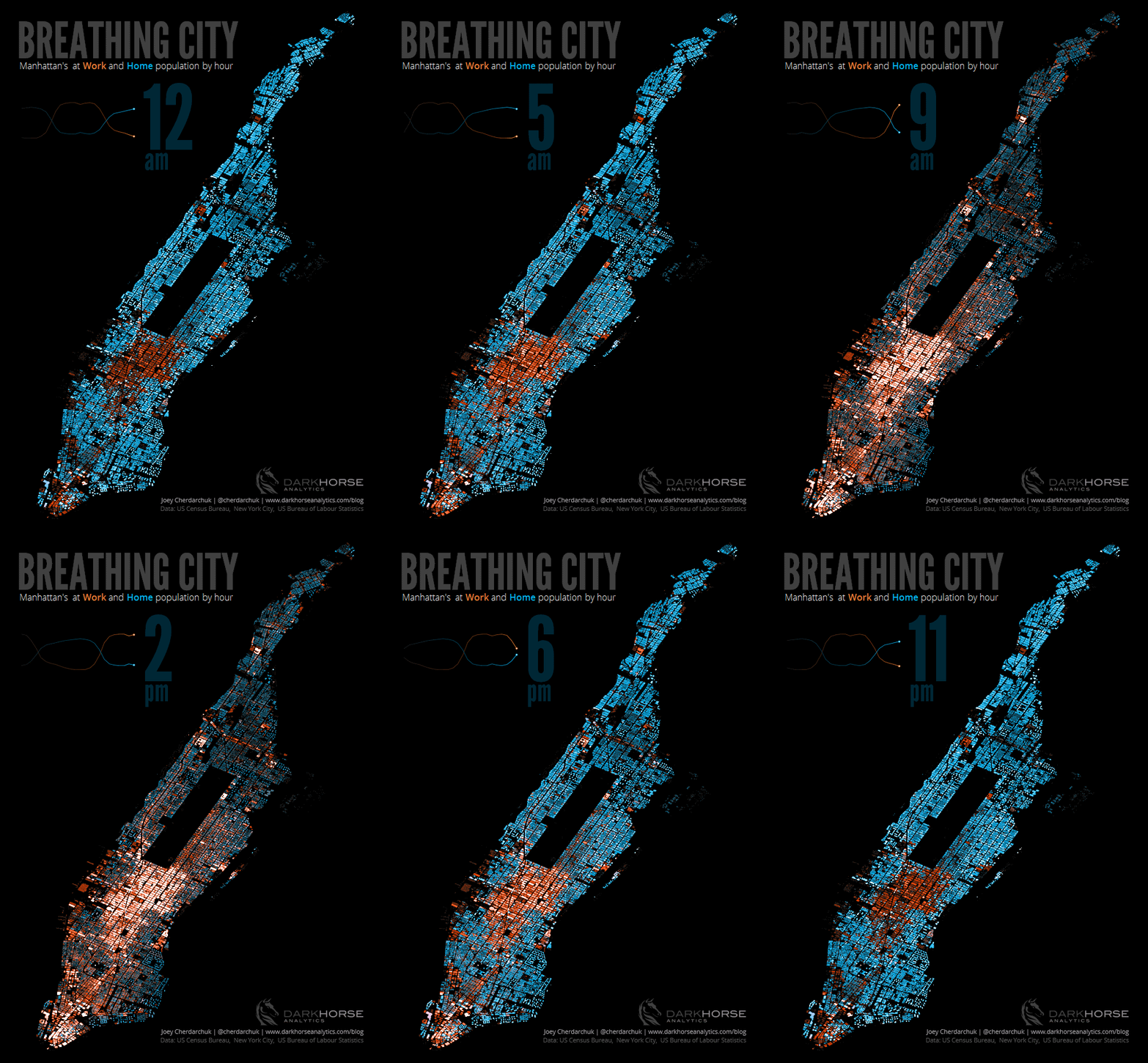
Breathing City is an engaging visual:
I’m mesmerized. I’m intrigued. I’m ready to share it with my social media peeps in less than five seconds and I’m still looking at it five minutes later.
The colour, the subtle animation, the way it looks like a lung slowly inhaling and exhaling -- all of these conspire to engage me. Knowing that I’m seeing a sped-up version of New Yorkers’ commuting habits just adds to the emotion. I find myself looking at individual structures, imagining those crazy I-bankers working ridiculous hours as they chase their ill-defined american dream.
Alright. Let’s give it an engagement score: 5/5.
Let’s do one more. Here we have the Baby Names data viz. Go ahead. Walk through it if you haven’t already tried it:
Finished? It’s great that a dataset with three elements - name, year, and gender - can yield such a fascinating narrative. Notice how the mix of animation, storytelling, and interactivity keeps your attention to the end. You find yourself hoping we keep updating it with new names so you can select that perfect moniker for your unique, yet not weird baby. 5/5
And yes, you’re right, we should update it.
The Visualization spectrum
So we’ve now ranked a few visualizations on two dimensions: Clarity and Engagement. Actually we ranked some of them on Clarity and others on Engagement. That was by design.
Clarity is about accurate decisions. Engagement is about adoption and buy-in.
Clarity is science and rationality. Engagement is art and emotion.
It seems apparent that we should be posting these on a spectrum.
Left-brain for clarity. Right-brain for engagement.
Let’s call it the Visualization Spectrum (™)
If your data visualization is neither clear nor engaging, then you can’t call it a visualization. It’s a hot mess. But if it is one of these, then chances are, it’s not the other. You are either good at clarity, or you’re good at engagement. It would be nice to have both, but you know what they say about cakes and eating them...
Now let’s plot the visuals from above on the graph. Life Expectancies and Racing Speeds on the left, Breathing City and Baby Names on the right. Here we have it:
Does that look right? Does it make sense? Poorer visualizations would be in the middle - weighted toward whichever dimension was predominant.
Now where might we put the Suicide rate viz on this spectrum? Is it on the clarity side, or on the engagement side...
...Wait just a minute. That doesn’t make sense. The Suicide rate viz is as clear as the Life Expectancy and as engaging as the Breathing City. It seems that a one-to-one tradeoff just doesn’t cut it.
Apparently we’ll have to do away with our newly-minted Visualization Spectrum (™)...
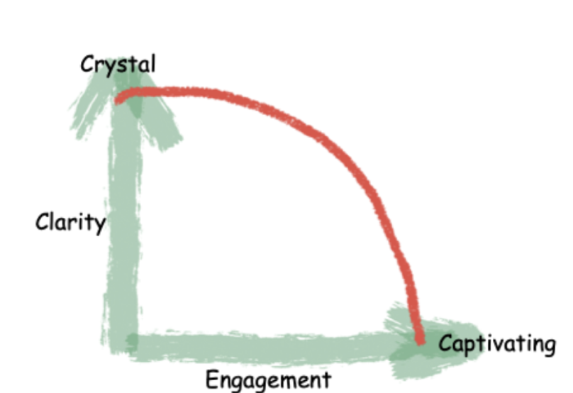
...and replace it with The Visualization Frontier (™).
Notice how there is still some tradeoff between Clarity and Engagement. One cannot create a visualization both perfectly clear and perfectly engaging (above and to the right of the red line). Nevertheless it seems that to some degree, we can have our cake and eat it too.
So let’s re-score our visualizations and plot them on the line:
Life Expectancy: Clarity 4, Engagement 2
The Pursuit of Faster: Clarity 3, Engagement 4
Breathing City: Clarity 3, Engagement 4.5
Baby Names: Clarity 3.5, Engagement 4.5
By definition, I can’t build a visualization with five star clarity and five star engagement - at least not with the red line as shown. There is still some kind of tradeoff. But the closer I get to the red line, the better off I am. (To be fair, the red line is a function of the visualization practitioner’s skill. The more capable, the sharper the curve and further the frontier will bulge out from the origin.)
So for the Life Expectancy viz, I can make it either more clear, more engaging, or some combination of the two. For Baby Names, I could sacrifice some engagement for clarity (i.e., move it up and to the left) or the inverse.
This seems like a useful way to categorize your visualizations. But it does beg the question: how do I make my visualization more clear or more engaging? How do I move up and to the right so that everything I build is on the red line?
More on that in the next post.


