Challenge
Why is creating maps with your data so hard? To create even the simplest of maps requires learning specialized tools, new data formats and a litany of commands tucked several click deep inside the menu bars. How can we speed up and simplify making a map?
Solution
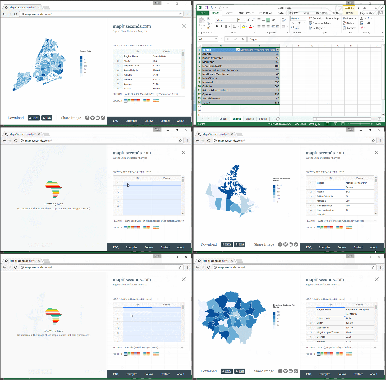
We started with the most straightforward data map – the choropleth – where regions on the map are colored according to their data values. Then we asked what is the bare minimum we can ask of the user to get them a map. Turns out we only need one thing: their data. Paste in properly formatted data from your spreadsheet and our algorithms can figure the rest out.
Result
MapInSeconds.com automatically chooses your map, from it database of 600 regions around the world, based on the district names you provide in your data. If it guesses wrong, you can manually select a different regional map. The smart legend adjusts to account for outliers and categorical vs numerical data. You can pick from a number of map-safe colour schemes and with one click download your image. Maps in seconds instead of hours.
You can read more about the tool in our blog post.


