

The NHL Playoffs are under way and [insert favourite team name here] fever has probably hit your town (unless, like us, your team has made your heart sad). About a year ago we had put together a static visualization of payroll rankings in the NHL, now we've extended it to a full interactive piece that lets you explore more than just payroll's impact on the sport. Interactivity in a data visualization shouldn't just mean tooltips when you click on something, it can be so much more powerful than that. Interactivity can provide whole new perspectives, facilitate more comparisons, and encourage exploration and discovery. This is readily apparent when you compare the static version of our graphic to this new interactive.
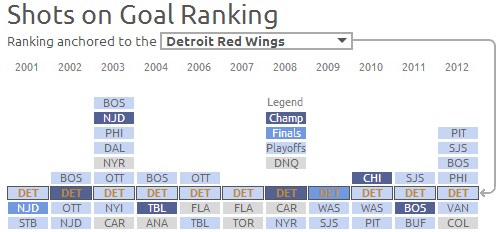
In this piece we've learned interesting facts about last year's LA Kings, the 2007 Anaheim Ducks and more. If we look specifically at Detroit we can see how they consistently make the playoffs (often the finals) and rank near the top of every metric we provided.
You can also see the dramatic effect the introduction of a salary cap had on the gap between the highest and lowest paid teams in the league.

I encourage you to explore this visualization and let us know what stories you discover in the data.