

One of Edward Tufte's most quotable quotes is "if the statistics are boring, then you've got the wrong numbers.” I wholeheartedly agree with this sentiment but good visualization is not just a matter of putting the right statistics in front of the audience. Aesthetics matter, and they matter a lot. Most people, whether they realize it or not, place a disproportionate amount of value on the look of things. People want, even need, to be engaged and good design is essential in ensuring they are. Studiesshow that more attractive people have higher incomes. This doesn't mean more attractive people are more effective in their positions, it means their attractiveness is valued and people are willing to pay for it. The same appears to be true for data visualization. Take, for instance, the OECD's announcement in January of the winner of their Global Data Visualization Contest.

The winning entry is visually stunning: well balanced, excellent colors, smooth animation. The problem is it is incredibly difficult to decode. Even with the legend right next to the visualization and a good amount of time playing with it, I was not able to gain any significant insight.
Now look at the entry to which they gave an honorable mention.

It doesn't take long to learn how to interpret it's display, all of the countries can be compared at a glance, and it is relatively clear what we are comparing and how to compare it. Interaction lets us filter so we can further our understanding, rather than just flipping us to another country as in the winner's.
The contest guidelines stated the visualization "should encourage comparison across the countries, and should reveal the individual statistics that go into these indicators." So why then did the contest judges choose the winner? Not because it is more insightful to look at, but (I think) because it's more enjoyable to look at. The "striking visual design, which draws users into exploring their piece" was mentioned specifically. These judging results indicate an unfortunately high weighting given to aesthetics.
What we can take from the this is that people highly value style, even to their own detriment. That means we need to value style but execute without causing detriment. We need to find a way to ensure that we not only deliver data in a meaningful way but also seek to deliver it in a compelling/engaging style. Function must come first, but if we ignore Form we risk being ignored.
To that end, I went through a little exercise to show that you don't need specialized tools to execute good design, in fact you can create "striking visual design" in something as ubiquitous as Excel, which most of us use regularly. Nicholas Felton's Feltron Annual Reports are a beautiful example of information design for the quantified self. If you haven't browsed them before, I encourage you to go and have a look. His elegant compositions turn what could be mundane statistics about someone we've never met into an engaging story about human actions and interactions.
Can we take a page out of Nicholas Felton's book and make it happen in Excel? Well, here is what happens if you use Excel's default charts to show some of his data.

Charts like these, while easy to read and understand, would not have garnered Mr. Felton much attention or interest never mind renown. But you can see below just how close we can get in applying his design to the charts and layouts. If we had some money to buy new fonts, we could get even closer.
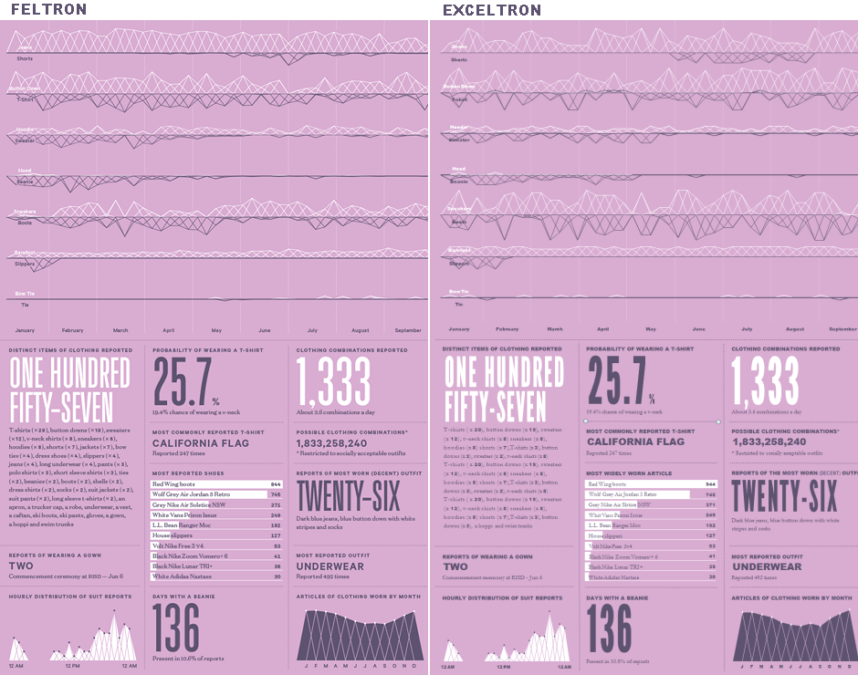
You can download the workbook to scroll around a full page and see how it is accomplished in Excel, though you will need the fantastic and free League Gothic font installed on your computer for some of the numbers to look as they should. I even threw random numbers in some of the charts so you can press F9 and watch them dance.
Good design isn't a matter of pushing a button, or selecting a theme. It takes effort to learn the language of graphic design and time to apply its principles. But that effort and time is well worth it when it garners a more engaged and enlightened viewer.
If the statistics are boring then you've got the wrong numbers. If no one is paying attention then maybe you need to work on your visuals.