


Design for America was an excellent initiative by Sunlight Labs that encouraged contestants to apply design and data visualization techniques to the wealth of government data that is now available. This visualization by Pitch Interactive which won the Visualization of Data from the Federal Budget category in 2010 is an interesting piece of data art:
Unfortunately it fails to deliver on the competition's stated goal "to make government data more accessible and comprehensible to the American public." It is certainly engaging, but at the cost of being extremely difficult to interpret. Even at high resolutions I can't read the items at the bottom. Nor can I give you a reasonable estimate of the percentages for Health, and Health is the top media coverage item. The only conclusion it effectively portrays is "Defense contract spending is disproportionate to its media coverage". Political Math explored problems with the spending data used in the chart as well as with how the circles were scaled by radius rather than area. They then produced a revised version of the graph:
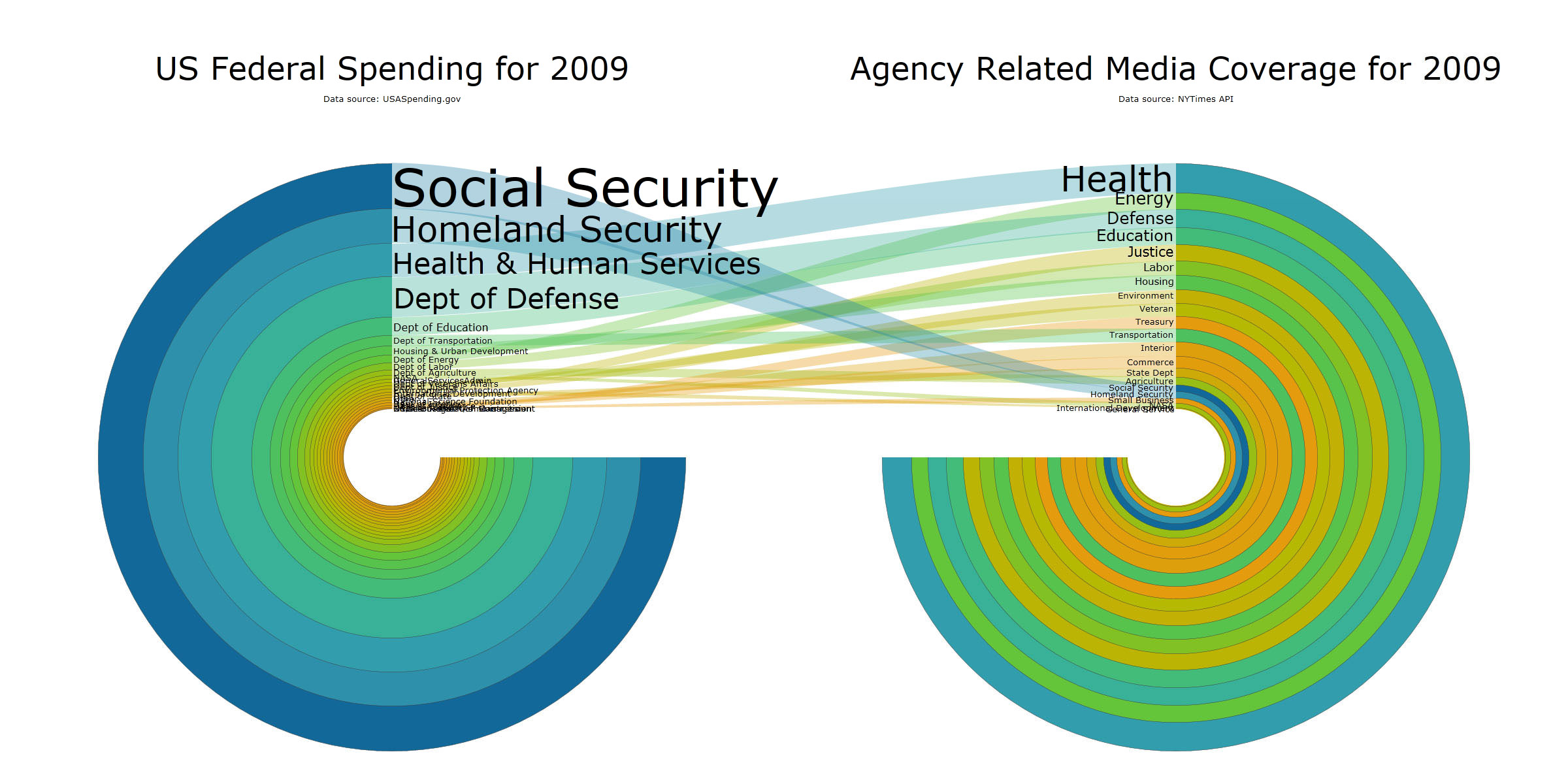
Even with better data the chart is no more useful. Using circles to display the data introduces confusion as to how the data should be read. Should we compare the radius of the rings or their area? I actually find myself just looking at the radius length right next to the labels and ignoring the remaining area of the circle. Others, like Political Math, might look at it and compare the areas. Again, with no scale incorporated, it is incredibly difficult to estimate even rough percentages for any of the categories. Following the semi-transparent connections between the two data sets is also difficult especially for the smaller categories which are unreadable in most cases.
Three simple bar charts serve the data and the viewer much better. Relationships which were completely occluded in the above graphics are now quite apparent. Comparisons are clear, categories with relatively small values are legible, and misinterpretations of the scale are unlikely.
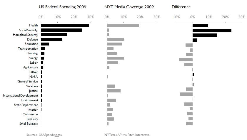
Note: my extract of data from USASpending.gov came back with different figures than those reported in Political Math’s chart.
Alas, no one is going to give me an award for making a set of three bar charts, however, everyone is going to have a much easier time making conclusions with it.
Joey
----UPDATE----
Mere minutes after posting this I was made aware on the discussion boards at Perceptual Edge that they had critiqued this same graphic in a far more timely manner on their blog. Their post features additional redesigns and discussion, including responses from a member of the team who created the graphic. It is definitely worth reading.
In the future I'll have to make sure my critiques are a little more current.