A while back one of our employees was buying a house and journeyed out into the vast interwebs to do some mortgage calculation. His trek was long, winding and far less fruitful than hoped. In the end, he had to create a custom spreadsheet because the tools available were too unwieldy or inflexible to answer his simple questions. He suggested we might like to take this on as an internal visualization project sometime in the future. Well the future has arrived and it is simple. We are not in the financing and loans business, but this application provides us the opportunity to demonstrate some simple design principles. Please play with A Better Mortgage and Loan Calculator and read on.
Simple Questions
Most calculators make the answering your question needlessly complex. They ask for information that helps them and not you or use dense, industry jargon that you must decipher. You shouldn't need to know the difference between interest term and amortization period. Eliminate those roadblocks and you eliminate frustration.
We started by investigating what questions the typical borrower has. In the end we boiled it down to three: How much can I afford to borrow? What will my payments be? How long will it take me to pay it down?
Give us an interest rate and answer two of those questions and we can answer the third for you.
Simple Hierarchy
What is most important must appear most important. Most calculators make little distinction between the essential, the secondary, and unnecessary. Everything is similar in size and color, positioned with little care for how you will attend to the information. Below, for example, every number is bold and small, so it takes some time to find the one you’re looking for, not a lot of time, but why put even the slightest strain on you when we have the near infinite flexibility of HTML at our bidding.
We use size, color and position to help guide you through the process. A big title at the top tells you what question we're answering and lets you choose alternate questions. Inputs are highlighted feature clearly next but even more prominent is the big, bright answer to your question. Secondary charts and figures follow to provide additional context.
Simple Visuals
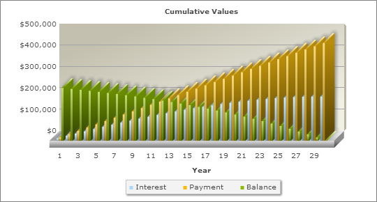
Visuals don't have to be complex or flashy. In this case simple visuals make a more effective display. Below is a particularly bad chart. With all the effort spent on its 3 dimensions, color gradients and drop shadows, they forgot to ask whether it was easy to read and understand. It shouldn't be hard to distinguish whether first green bar is at $200,000 or $250,000 but it is here.
The visuals we developed didn't require a new charting paradigm, they are simple charts where the clutter has been eliminated and labels and interactivity added to give an elegant and coherent view of the data.
Simple Interaction
The formula for calculating some of this can look complex, certainly more complex than your typical home buyer wants to think about. But by a computer's standards this is a very simple thing to calculate. Even your phone can perform this calculation thousands of times in a second. So instead of making you press the dreaded submit button for an answer, we just show you the answer anytime you change anything, making feedback immediate and the experience smooth.
This instant reaction allows you to quickly see how changes in your assumptions will impact payment amounts, interest paid, or time to pay back. We haven't just given one answer; we've provided the context of all the other answers of interest. For more on this type of interaction read Bret Victor's thoughts on Explorable Explanations.
Simple is worth it
“Simple can be harder than complex: You have to work hard to get your thinking clean to make it simple. But it’s worth it in the end because once you get there, you can move mountains.” ― Steve Jobs
Moving houses isn't moving mountains, but working hard to make even a calculator simple leads to satisfied, engaged users and creators.


