

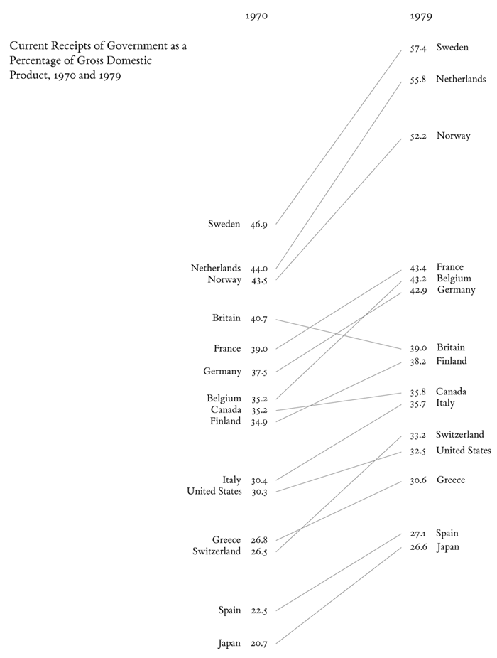
Over the past few months I've become increasingly fond of Edward Tufte's Slopegraphs for data visualization. For those who are unfamiliar with them, I encourage you to read Charlie Park's excellent essay on the subject. The graphic seems to have been getting more use and Park's essay if not catalytic was at least prophetic (or perhaps I'm just experiencing the Baader-Meinhof phenomenon). Tufte says "Slopegraphs compare changes over time for a list of nouns located on an ordinal or interval scale. " and we can see how effective it is in his example:
However, I've discovered it to be quite useful for displaying differences that aren't necessarily over time. To illustrate, I created the slopegraph below which is exceedingly effective at displaying life expectancy differences across countries between males and females.

Not only can you see the countries' rankings and relative values, but it is also easy to see aberrations (Zaire where men live longer than women), patterns (countries with higher life expectancies have a bigger difference between men and women), and comparisons (Russia v. Iran is my favorite).
The clean and precise nature of slopegraphs makes exploring and understanding data so much easier than some more fanciful representations. So how do you make a slopegraph? Charlie Park's follow-up post lists a number of tools to help you create one. Personally I use Excel and recently Jon Peltier put together a nice tutorial.
If you want to read more on slopegraphs Edward Tufte's forum has twothreads you might find interesting.